[Note: Since this piece has created quite a lot of interest, it’s worth noting that I’ve only really considered UK national stations and brands here. I know that there are lots of stations in Europe, the US and beyond, from Q Music and RTL Radiovisione, that essentially produce something that’s half music radio station and half music TV channel, to The Dave Ramsey Show which is basically shot on a TV set and could just as easily go out on TV. The key difference between this kind of output and what I’m talking about here, is how the output is intended to be watched. For the most part, for these stations, their streams are there to be watched live. With UK stations with studio cameras, the real benefit is the ability to create socially shareable clips. Stations might open up their live streams too, and some listeners love to see “behind the curtain,” watching a presenter at work, or find out how a radio station works. But the real strength in having cameras in the studio is to maintain a relationship with your audience online, and to share buzzworthy clips that might in turn ultimately bring in new audiences.]
In the last few years, everyone has been upping their game when they rebuild or refit their radio studios.
Global spent a lot of money fitting out Leicester Square with smart studios with screens, cameras and LED lighting. Flick a switch and you can change brands. With more and more of the output national, they currently or will soon host a number of national breakfast shows from Capital and Heart to LBC and Classic FM.
Bauer similarly has spent money in the more confined space in Golden Square. They have smart studios for major brands including Absolute, Kiss and Magic.
Talksport has just moved into its new studios in the News UK building at London Bridge. The same building is also home to Chris Evans’ Virgin Radio breakfast show.
Many of the BBC’s studios have camera placements for newsworthy clips from Today on Radio 4 or from Five Live.
Video cameras have always been “guests” in radio studios. If there was a noteworthy interview or event, stations would video the output themselves, or invite news crews in. But I think it’s fair to say that in recent times, LBC has really shown the way with what’s possible, and it’s still technically best-in-breed.
Their strategy of giving politicians their own shows and regular phone-ins has been a solid way for them to generate news headlines that are easily illustratable for TV news.
Broadly speaking – everyone else has looked and copied.
Added to which, listeners expect video, shareable on social platforms, and most radio groups have some kind of dedicated video resource.
But, I would argue that it’s not actually being done as well as it could. Nobody has truly cracked it – even LBC. Lighting is pretty good these days, but good cameras today are much more forgiving about poor light conditions anyway.
It’s also worth saying that different stations have different output needs. If I’m Radio 4 or LBC, I’m thinking of clips that will be shared on TV news bulletins, as well as social sharing. If I’m Capital or Radio 1, I’m thinking about mobile phone screens being the primary platform for consumption.
What I’m not going to do here is dive into the whys and wherefores of using video to visualise radio. This is more about the language of video.
I’ll illustrate my reasoning using some very recent examples, and explain some of the problems and the things I think can be improved.
Look – we’re streets ahead of where we used to be. But I’m not sure that we’re there yet.
Radio Studios Are First and Foremost for Radio
A bit obvious this one, but don’t overlook it. Looking good on camera is by-product of sounding good on the radio. That means a big microphone, usually right in front of the speaker’s face.
It means headphones, and often a lot of looking down at pieces of paper or at computer monitors that these days are often “buried” into the desk.
The presenter usually needs buttons and faders, even though a producer may share some of the load. They also need screens with texts, Tweets, emails and Google searches. They might need TV monitors for news or sports events.
And this isn’t all set-dressing. This is all very practical kit that has to be accessible.
So while long gone are the shelves of “carts” with jingles, racks of CDs, and generally yellowing decor caused by years of chain smoking presenters, there’s still a functionality that’s critical.
My own view is that this shouldn’t be hidden. As viewers and listeners, we understand that the studio, like any other place of work, has to be functioning thing.
That doesn’t mean a studio should be messy, but you’re not making a TV show. So you don’t completely need to ape Saturday night shiny floor shows.
The Wrong Camera Positions
Because of the location being a radio studio, camera positions are often poorly placed. The easiest place to post-fit a remote camera is somewhere up high. But in TV, the camera is usually at eye-level with the presenter. On the radio, that can be hard to do.
🗣 @AndyGoldstein05: “Kevin, legally you need the bill payer’s permission.”
— talkSPORT (@talkSPORT) April 5, 2019
📞 Caller: “Hello, this is Kevin’s father, Schmeltz Herring…”
🗣 @AndyGoldstein05: “Your wife there?”
📞 Caller: “It’s Hannah, from São Paulo”
One of our funniest calls EVER 😂😂 pic.twitter.com/l1Vi30U6bo
Here’s a video from Talksport’s new studio which shows what I mean. All the camera positions are just a little too high. We’re looking down at seated people and are seeing a lot of tops of heads. It’s slightly exacerbated by the fact that presenters naturally look down at screens or papers on their desk.
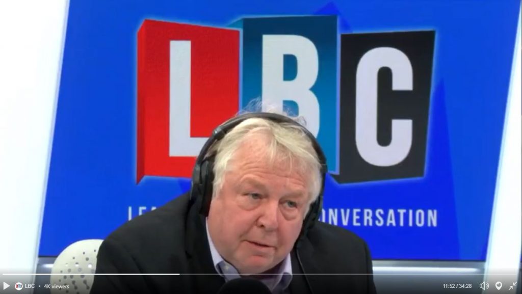
LBC is better, with lower camera positions, but it’s still not perfect and ideally would be a tiny bit lower. But there’s a also framing issue (see below).
In this Five Live example, the camera has clearly been added after all the radio “stuff” has been put in place in the studio. So we end up with video from the side that feels very cramped indeed. Is Emma Barnett broadcasting from a cupboard?
Framing
This is probably a marketing decision more than anything else, but it leads to awkward video.
Many of these camera positions are set-up to maximise the space behind presenters where station logos are. When LBC gets a clip on the news, they want to make sure that viewers know where the clip originated.

Here’s a frame of Nick Ferrari – but he only seems to taking up the bottom half of the screen. It’s true – he’s leaning forward slightly, but it looks like someone has wanted to keep as much of the LBC logo in frame as possible.
A more “natural” way to frame this image would be to shift the camera down a little so that Ferrari’s eyeline was in around the top third of the screen, and to perhaps to crop in a tiny bit closer.
I would argue that you could still do this, and maintain strong branding on screen – perhaps with smaller logos either side of his head.
Cropping Can be Claustrophobic
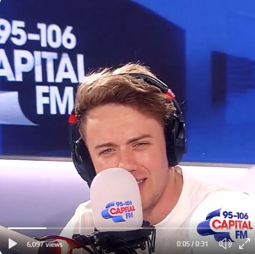
The kids are all sharing square format video these days – it’s the Instagram default. But bear in mind that an already small radio studio can look even smaller.

And if your presenter gets in close to his mic, then somehow the effect is magnified.
“It was a hot summer’s day… ☀️
— BBC Radio 1 (@BBCR1) April 10, 2019
🍦 and some vanilla ice-cream falls on my arm…” 🤢
The pigeons are out to get you @scott_mills 👀 pic.twitter.com/JGOilYy9J0
Radio 1 does this better. The cameras have wider lenses on them, so even though they’re placed close to the presenters and guests, they’re not quite as “in your face.” Also, everything doesn’t have the brightness turned up to 11.
But only jumping between close-ups still leaves you feeling a little claustrophobic. They don’t seem to use any wide shots ever.
Wide-shots also give you a sense of space – where is the presenter sitting in relation to the guest(s)? We may not know it, but we’ve been conditioned by watching thousands of hours of video, to understand things like the 180 degree rule.
Get the Right Lens
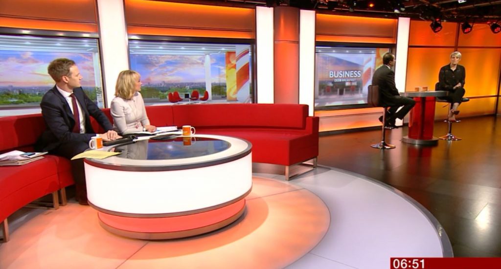
And by that, I mean a really good quality wide angle lens. A good example of that in use is on BBC Breakfast. The studio they use in Salford is relatively small, but they use wide-angle lenses to make the space look bigger.

It looks massive here, but actually that’s a trick of a camera lens. It’s probably quite an expensive lens because it doesn’t really distort at the edges.
Anyone who’s ever been in a radio studio knows that they’re all actually quite small. So getting a good wide angle lens can make it appear bigger than it truly is.
Automated Camera Cutting
For the most part, cameras placed in radio studios are in locked off positions. This in part explains some of the bad framing – lots of presenters will be sitting in that chair, and the camera needs to capture the short ones and the tall ones. (A more sophisticated set-up might allow a presenter to shift the camera in the same way that they have their own personal mic settings, or different drivers in high-end cars can have personal seat preferences pre-programmed.)
Another technique that’s used is to have some kind of automation, cutting between the cameras on the presenter and the guest, and perhaps adding wide shots.
Often, the solution is to use microphones as an indicator as to which camera should be live. That’s also what things like Google Hangouts do. If a microphone is detecting audio, then cut to the camera that’s on that mic. Then cut to the other camera when the other person is talking.
The problem is that you don’t want too many cuts – particularly if people are talking over one another.
Near the start of this video, there are a few short clips of Dave Berry when he’s laughing. I don’t know that we cut to him so briefly because of an automated algorithm. But I suspect so. The quick cuts are jarring. They’re so brief – they remind me of that famous Liam Neeson jumping a fence scene in Taken 3.
The Dangers of Autofocus
Does 007🔫 need a revamp?@jessiecath argues culture is changing so James Bond has to "adapt to survive", but @monstroso says the films are already adapting #r4today | https://t.co/3zzkbuzzli | @justinonweb pic.twitter.com/bsXRRRE3ev
— BBC Radio 4 Today (@BBCr4today) April 15, 2019
It’s never great if a guest is out of focus. Here, the camera seems to be focused on the “backboard” of the Today studio, which itself feels like something footballers stand in front of during post-match interviews (would a BBC current affairs TV show ever be branded like this?). One way around this is to use a lens aperture that allows everything to be in focus. Things like this do matter.
In point of fact, that’s not a backboard, but a screen behind the guest. You wouldn’t know it, were it not from the incredibly subtle animated “o” in the Today logo.
Don’t Use Scrolling Text
It’s very internet – circa 1997 from your Geocities site.
Yes the news channels still do it, but they’re aiming for an audience who can’t hear the volume and have nothing else to look at in the airport departure lounge.
Also, unless you have the video refresh on your screens and the frame-rate of your camera carefully aligned, it won’t look good on video.
Sorry Talksport.
Use an “Underarm” Mic Arm
A good point mentioned by CapitalMblog on Twitter. The standard way to mount a microphone is via an arm that comes in down in front of the presenter. The arm keeps things out of the way, and of course it didn’t matter that it blocked a face when you didn’t have to worry about cameras.
An “underarm” can be more subtle and doesn’t get in the way as much. But it will vary depending on the studio.
Conclusions
What becomes ever clearer from all of this is that radio stations need to think differently about how they build and design a studio from the outset.
There are lots of skilled radio studio designers who’ve traditionally worked hard to build studios that will create the best sound possible, giving presenters an optimal working environment. But today you need to plan in what your studio should look like on camera. It’s notable that Global brought in a designer who specialises in TV studios when they rebuilt theirs. Getting those camera angles sorted right at the start is probably the way to go. Then you can work out where screens and microphones go.
That might mean some compromises have to be made. But just about every radio station is sharing clips socially one way or another, so building a system that incorporates that this need at the start seems essential. It should be integrated into the design process alongside all the other key requirements.
And that goes as much for smaller stations as it does for larger ones. Global’s multi-million pound refits might be at the top end, but cheaper cameras can be used at the budget end, and with well placed HD webcams, some LED lights and something like the free OBS Studio, you can get something pretty powerful.
I’m not sure you need to go the full “TV studio set” direction. This is radio after all.
The one key difference is that with TV, the presenter will always be looking at the camera. With radio, the presenter will rarely, if ever, be looking that way. They’re concentrating on making a radio programme. For that reason alone, they need to be thought of differently.
[Updated, based on Twitter responses, to include Radio 1, which I should have included, and to include a good note on microphone arms.]
[Further updated to include a conclusion, again following correspondence on Twitter. Thanks to everyone who commented.]

Comments
4 responses to “Video Cameras in Radio Studios”
A great read Adam, thank you. At what point do you think radio will (for some shows at least) resource it properly and crew it up for video eg go manual? As far as I know Howard Stern has been doing it like this for about 15 years. Surely the auto set up only gets you so far and many of the framing, focus and cutting issues you speak of can be overcome by just resourcing it properly? Have you seen how Dave Ramsey does it?
I deliberately steered clear of non-UK shows, because money and scale can come into play. With Stern there is the Sirius XM cash that mean he has a massive bespoke space in their building. His studio is closer to a studio set. That said, the camera on him is always shooting downwards which isn’t great – I suspect because he wants nothing to get in the way of *sounding* good on air.
The Dave Ramsey Show is basically a TV show that happens to go out on the radio – at least in how it’s presented. Even more than with Stern, they’ve build a complete studio set for him, with studio cameras and quite likely, camera operators (even if the cameras are largely remote controlled).
I guess that all of this is worth it because the show generates millions and millions of dollars. It has a 300m+ country to work with; his channel has over 1m subscribers and his videos sometimes get into 7 figures for views. His YouTube presence alone is probably a significant income generator.
I don’t think it’s really fair to compare these guys directly with UK radio because of all this scale. Would staffing up to improve output really deliver the streaming returns? With the commercial sector in particular, that’s what you have to ask.
Really interesting piece… In my experience, it is usually engineering who place the cameras rather than anyone with a trained visual perspective… I think Adam is right about how marketing have a hand in studio dressing and logo positioning though…
When I was Group PD of Communicorp, we built an early version of a camera switching system, with some brilliant Hungarian boffins, based on the technology used for conference calls, which simply buffered slightly to allow the camera to follow the loudest audio – it took a lot of tweaking to get a version that works and there are now some really good commercial versions available… The hardest part was getting enough storage space for the video files, pre cloud…
The most impressive use of it for me is Capital and the integration of video / Facetiming with celebs – it’s very much on target and neatly done
Always, the challenge is in finding sharing the right clip quickly… My current pet peeve is the Chris Evan’s clips that Virgin post – which almost always exclude any footage of Chris – I do not understand why…
Liam
Thanks Liam. You’re right that automatic camera switching has come on a lot – and there are a variety of solutions out there. I suspect that all need some tweaking depending use case.
I’ve not really considered things like video calls with celebrities, and integrating that into the show. But I’m sure that Capital is using a full video mixing desk to allow it to grab an external source and mix it straight into its output.
Interesting note on the lack of Chris Evans in Virgin clips…